Shades, Light, and the City: A Color-Coded Journey

Today we set out on ‘Color-Coded Photo Journeys: Seeing Cities through Shades and Light,’ exploring how palettes, tonal contrast, and time-of-day glow can turn ordinary streets into living stories. Expect practical steps, heartfelt anecdotes, and invitations to participate, share discoveries, and spark richer ways of seeing together.

Palette Planning Before the First Step

Mapping Hues to Districts

Start with a paper map or offline app and color-code neighborhoods by dominant tones you observe during test walks. Brick reds, river blues, market yellows, and park greens each suggest different moods and stories, guiding routes that maximize visual coherence while leaving space for surprise.

Shot Lists Guided by Shade and Illumination

Translate observations into a flexible shot list organized by hue families and lighting scenarios. Combine wide establishing frames with detail studies to keep rhythm lively. Leave intentional gaps for spontaneous encounters, because unscripted people, weather, and transit rhythms often deliver the unforgettable anchor image.

Tools, Filters, and White Balance Choices

Pack a small kit serving your color goals: a circular polarizer for glare and sky deepening, a soft mist filter for bloom, a neutral-density option for motion blur, and gray card for consistent balance. Preprogram custom white balance presets matched to anticipated streetlight temperatures.

Light as Storyteller: Timing, Weather, Direction

Light quietly rewrites the same corner every hour, and understanding this rhythm helps color sing. Study cardinal direction, seasonal altitude, cloud type, and surface reflectivity. Embrace imperfect weather; mist, drizzle, and fog can soften palettes, while hard noon sun sculpts graphic geometry worth celebrating.

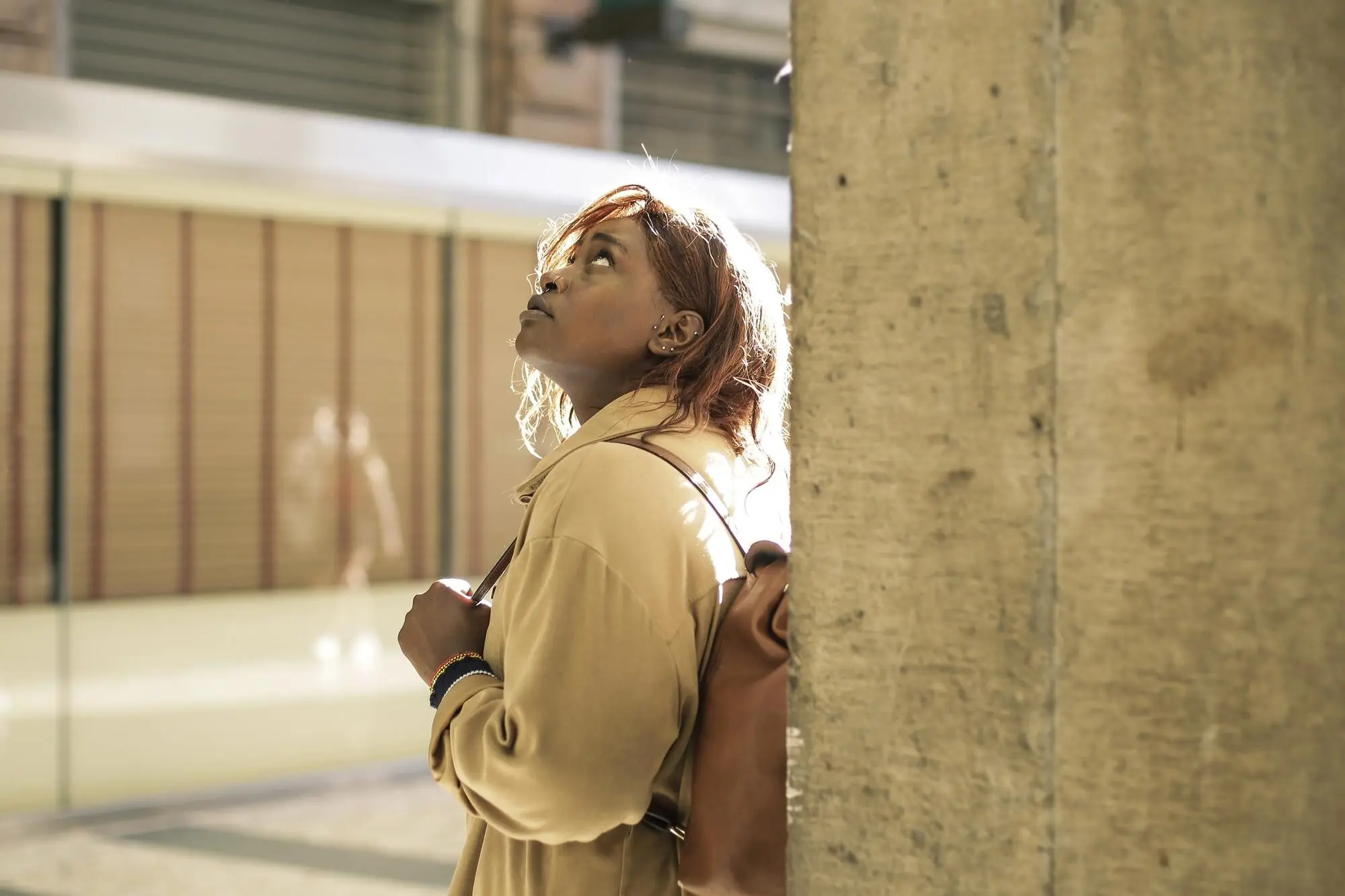
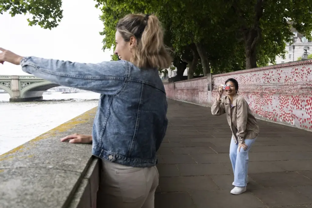
Golden Hour Warmth and Long Shadows

Plan routes that catch low-angle warmth skimming facades, igniting bricks and brass signage. Long shadows add dimensional drama and isolate color blocks. If crowds surge, wait for a single figure in contrasting clothing to cross, giving scale and a precise accent within the frame.

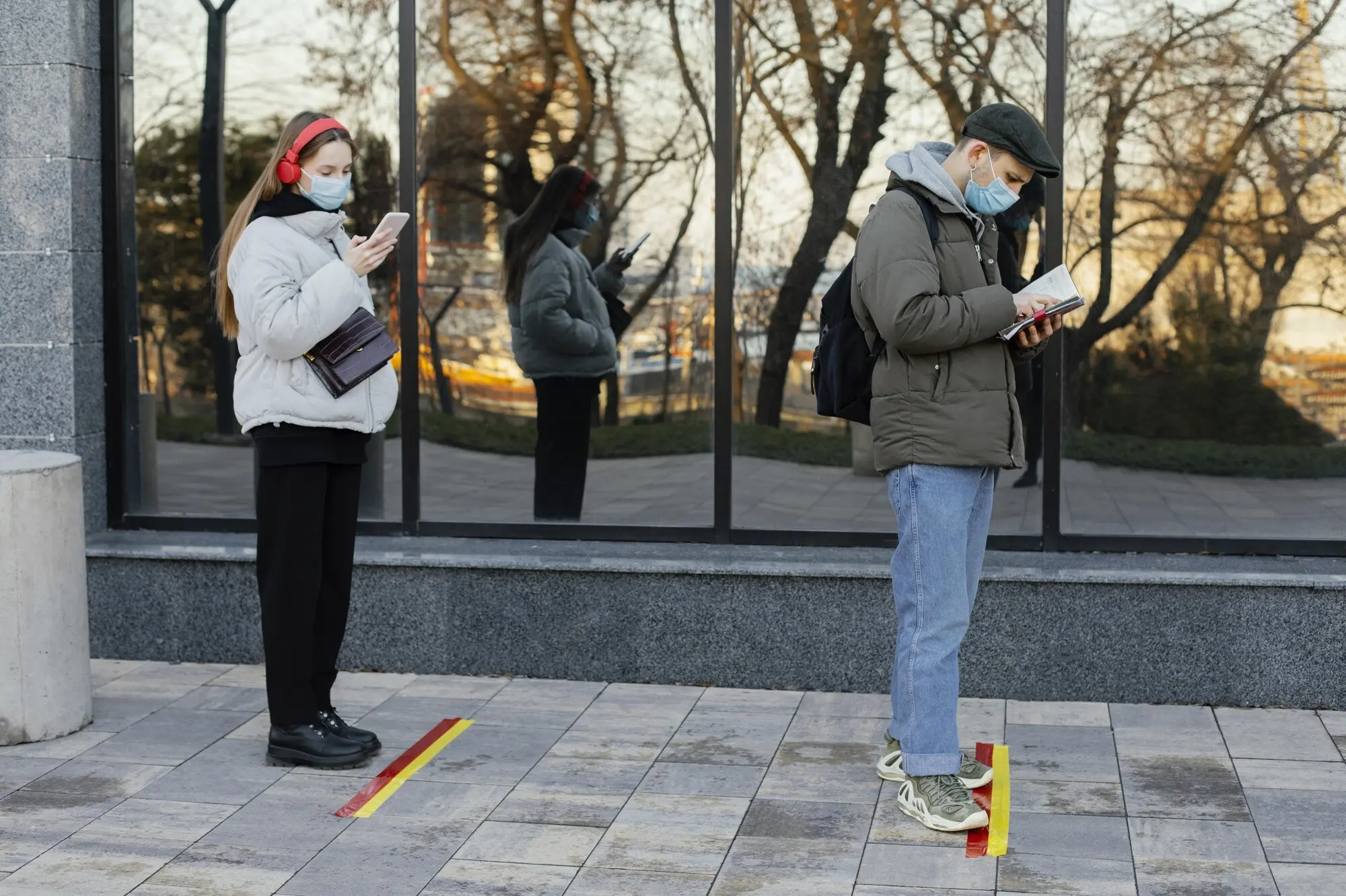
Overcast Softboxes and Reflective Streets

Flat light minimizes harsh contrast and turns the city into a giant softbox, perfect for nuanced palettes and skin tones. Seek reflective surfaces like painted doors and wet pavements. Colors become creamy, textures glow, and small gestures read clearly without being crushed by brightness.

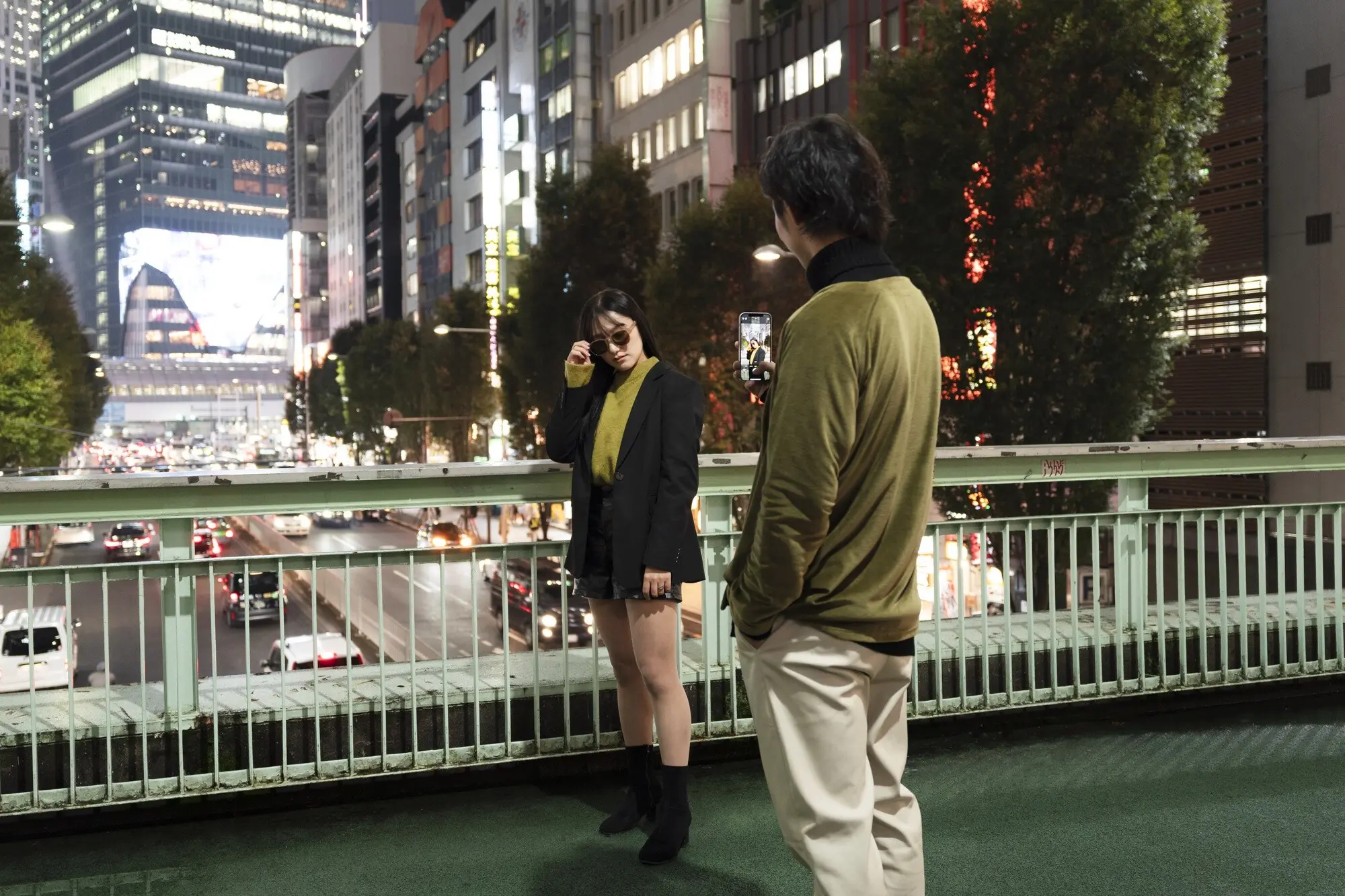
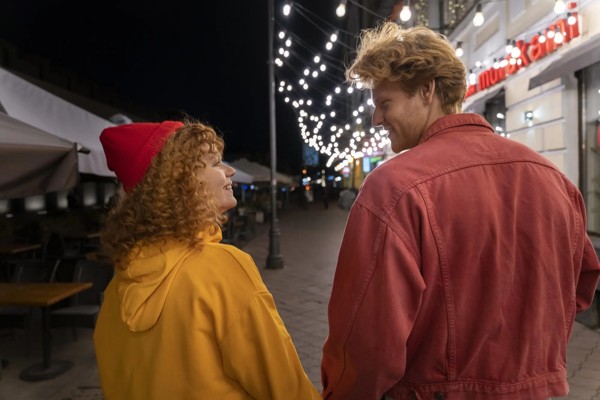
Blue Hour, Neon, and Night Glow

Blue hour cools concrete to slate, ignites windows with tungsten warmth, and invites neon to dance. Stabilize your camera, expose for highlights, and let ambient shadows breathe. Color contrast intensifies, reflections multiply, and the ordinary storefront transforms into a radiant stage for passing stories.

Composing for Color: Structure That Lets Hue Speak

Composition channels attention so that color does the talking without shouting. Use geometry, layering, and pacing to reveal hue relationships. Thoughtful structure prevents overload, keeps eyes moving, and creates space for emotions to surface alongside the factual record of the street.

Morning Market: Saffron Overture

I began at a market where saffron fabrics caught the first sun, their fibers glowing like embers. A vendor laughed as pigeons erupted, scattering yellow petals. The frame held warmth, motion, and generosity, establishing a hopeful overture that would echo throughout subsequent corners.

Midday Transit: Cobalt Interlude

By midday the trains hammered silver light across platforms, draining warmth and sharpening edges. I chased triangles of shade, waiting for a cobalt jacket to slice the glare. When it arrived, the whole scene clicked, a cool interlude balancing the morning’s richness.

Rain and Neon: Crimson Coda

Night poured rain onto glass awnings, turning signage into watercolor. I steadied against a post, counting breaths while taxis braided reflections. One umbrella flashed crimson beneath a blue billboard, and the frame finally exhaled—a closing cadence where saturated notes resolved the day’s wandering melody.

Editing With Integrity: Grading That Honors Reality

Editing should strengthen intent while respecting reality. Aim to recover how the moment felt: air temperature, crowd tempo, and the hum of light. Subtle global moves paired with targeted corrections can clarify relationships among hues without flattening the delicate atmosphere you witnessed.

Sharing, Sequencing, and Community

Photographs live richer lives when they travel. Share sequences, solicit reactions, and invite collaborators to join future walks. Organize challenges around specific palettes, publish behind-the-scenes notes, and host critique circles. The conversations teach, encourage, and keep curiosity burning long after batteries fade.

Captions, Hashtags, and Accessible Storytelling

Use platform-native tools—alt text, carousels, and captions—to make color intent legible. Tag locations thoughtfully, credit street artists, and include process tidbits that spark dialogue. Ask a question in every post, then return to answer; reciprocity builds the most enduring communities.

Narrative Sequences That Guide the Eye

Arrange frames like musical movements: overture, development, reprise, coda. Lead with a bold opener, vary tempo with details, and reserve the crescendo for blue hour. Sequencing clarifies your intention and helps viewers feel a guided experience rather than random sightseeing.

Host a Color Walk and Grow Together

Announce a monthly color walk in your city, set simple guardrails, and invite readers to co-create a shared gallery. Provide a downloadable brief, then publish highlights with micro-interviews. Encourage sign-ups, newsletter replies, and location suggestions so the next stroll becomes a collaborative adventure.